Warm Tone 101
How we approach warm tone
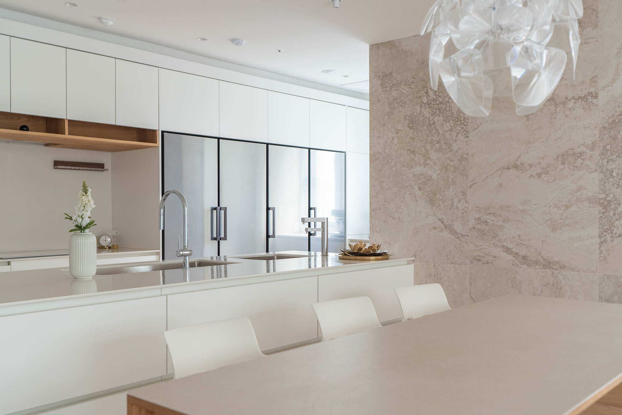
Sometimes a hit song is written in 5 minutes. Same could be said to interior design. Having many design options doesn’t always end with the best result. Infact, most cases it’s the opposite. The livingroom and the kitchen designs were confirmed at the very early stage of the design. In contrast to the main spaces, we had many design variations to encorporate the client’s specific needs. Warm tone wood and cermaic tiles were used to set the tone and the feel of the house.
First things first. We listen. We listen to the client’s requests. We try to find out what color they like, what were the difficulties they had in their previous house, what mood they prefer, and even how much shoes they have. We sum up the information into a mood board and try to visualize the space thorough reference images.
Throughout this home, we used three of our favorite materials; oak veneered panels for the shelving, and Travetino Rapolano cermaic-tile for the wall and hard-wood oak for window frame. Such materials bring a warm and snug feeling. The design for the main space was inspired by incorporating the conversation we had with the client and the design was almost fixed at the first meeting. Subsidiary spaces in other-hand, had many feed-backs and we listened again to develop our design.
Entry
A
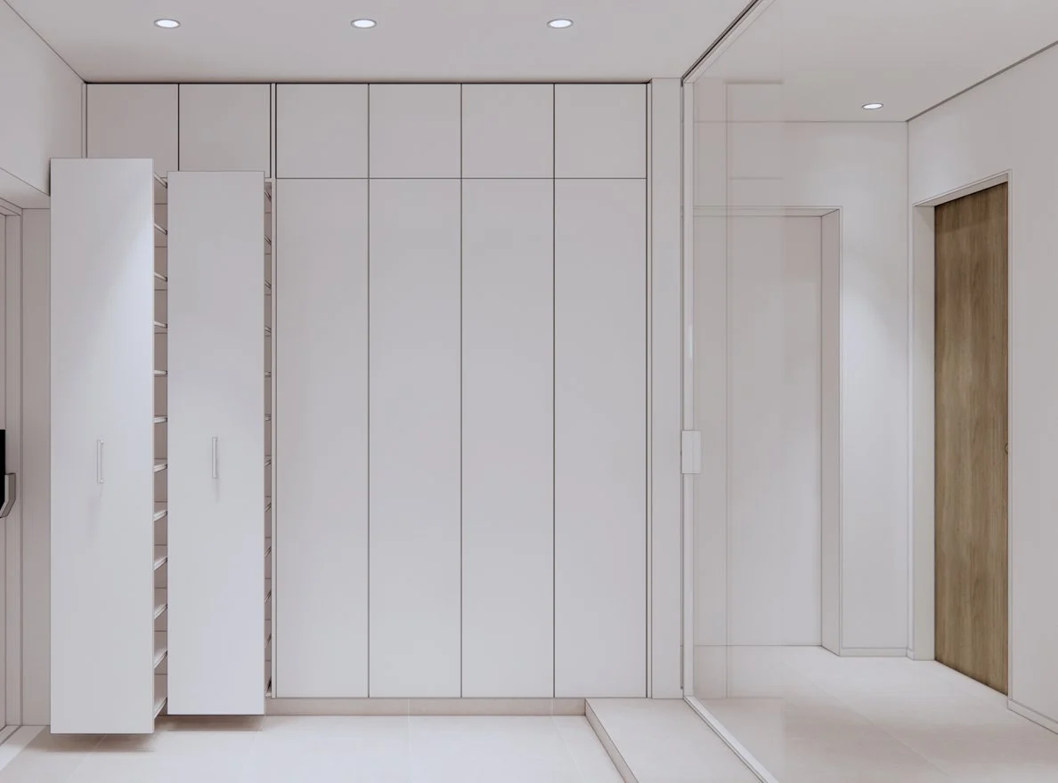
The client needed lots of storage space. Our initial idea was to make a small storage space at the entrance. We quickly realized that although the client needed lots of storage, they had more shoes than large objects.
B
We designed more storage for shoes and a bench, and used large tile accents and oak wood. The client liked the idea of a bench but wanted something bigger.
C
As conversation grew, we simplified our approach. We designed all the left wall with shoe racks. Also, we added two slide shelving to maximize storage quantity.
As for the bench, we allocated a large opening on the opposite side of the wall. Large Travertino Oniciate tile, 900*1800, was used as finish on the back of the bench. The tile creates a warm welcoming space while functioning as a stain-free material.
Kids Room
A
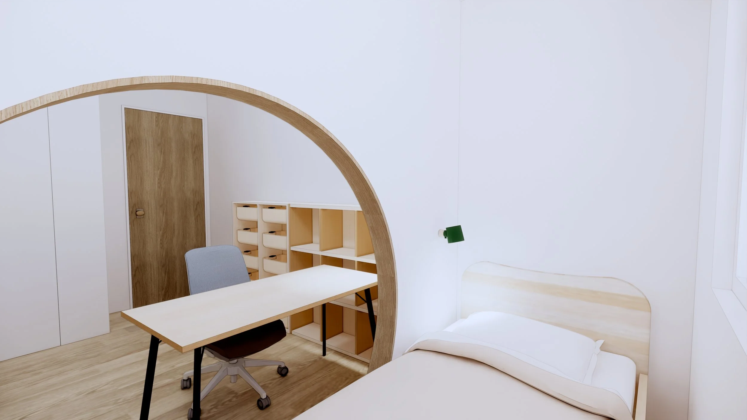
Rooms for children is always hard. Kids grow. Unfortunately, space doesn’t. As most parents, the client wanted to give the best for their children. At first we designed a circular opening in front of the bed to give the space a playful touch.
B
We explain to all of our clients how children out-grow the interior, literally. Although the first design was interesting, the space wasn’t flexible enough. Budget specially plays a big role when designing space for children. The parents must be committed to change the room according to the child’s age. As we explain more and more, the client agreed to tone down the design.
C
In the end, like most cases, we ended up with using “good furniture”. There are cases where parents do create playful space for the children, but most cases, good furniture is a safe answer.
We selected prefabricated furniture; desk, book shelves, bed, and channel shelves. A point to consider when designing rooms for kids are good lighting. We added wall lamp which can be controlled on the bed for late night reading.
Master Bed Room & Powder
A
B
C
D
The bedroom space also was designed many times. Different types of mirrors were presented to the client. The entry to the powder space was skewed to the left using a plywood finish, which gave a clean and cozy feel to the space. Wall mounted TV was hidden behind sliding wall dresser to give a simple yet functional look.
Check out our VR Tour for 360 view of the design
CREDITS
SPATIAL DESIGN
YAHG HEY-BIN
SPATIAL DESIGNER
CONSTRUCTION SUPERVISION
RYU SEONJONG
ENGINEER


